There is NO doubt that Responsive Website Design is very important for today’s webdesign point of view. Smartphone and tablet are being used by so many users, the usage of tablets and smart phone is rapidly increasing, so does the importance of mobile-friendly websites. Smartphones and tablets have changed the approach toward design and user experience.
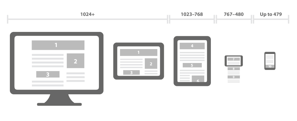
Responsive website design
Responsive website design approach is aimed at crafting sites to provide an optimal viewing experience—easy reading and navigation with a minimum of re-sizing, panning, and scrolling—across a wide range of devices
Why you should have a Responsive Website
1. Recommended By Google
With 67 percent search market share, when Google speaks, search marketers listen. Google states that responsive web design is its recommended mobile configuration, and even goes so far as to refer to responsive web design as the industry best practice.
This is because responsive design sites have one URL and the same HTML, regardless of device, which makes it easier and more efficient for Google to crawl, index, and organize content. Contrast this with a separate mobile site which has a different URL and different HTML than its desktop counterpart, requiring Google to crawl and index multiple versions of the same site.
Additionally, Google prefers responsive web design because content that lives on one website and one URL is much easier for users to share, interact with, and link to than content that lives on a separate mobile site.
Take for example a mobile user who shares content from a mobile site with a friend on Facebook who then accesses that content using a desktop, which results in that user viewing a stripped down mobile site on their desktop. This creates a less than optimal user-experience, and because of the large emphasis Google is now placing on user-experience as a ranking factor, this is essential to take into account with regards to SEO.
2. Mobile Usage is Exploding
This might not be a surprise for most of you, yet despite the impressive statistics below many businesses do not yet have a mobile website. Hopefully reading through these statistics will light a fire to stop ignoring the need for a mobile website.
- Over 20% of Google searches are being performed on a mobile device.
- In 2012 more than half of the local searches were performed on a mobile device.
- In the United States, 25% of internet users only access the internet on a mobile device
- 61% of people have a better opinion of brands when they offer a good mobile experience
- 25.85% of all emails are opened on mobile phones, and 10.16% are opened on tablets.
(via Smart Insights)
3. Positive User Experience Is Key
According to Google’s Think Insights on Mobile, if a user lands on your mobile website and is frustrated or doesn’t see what they are looking for, there’s a 61% chance they will leave immediately and go to another website (most likely a competitor). It’s also said that if they have a positive experience with your mobile website a user is 67% more likely to buy a product or use a service.
4. Blogging and Social Activities Bring Mobile Visitors
If you’re like most Inbound Marketers and have elements of blogging and social media incorporated in your strategy, you probably have been seeing increased mobile traffic. A recent study by ComScore cites that 55% of social media consumption happens on a mobile device.
With this being said, if you are sharing out content links or links to your website and don’t have a mobile friendly website, you’re not only going to experience high bounce rates and low conversion rates but also a frustrated audience.
5. Responsive Design is Preferred for SEO
In June 2012 at SMX Advanced, Google’s Pierre Farr went on the record to declare that Google prefers responsive web design over mobile templates. Having one single URL makes it easier for Google bot to crawl your site, Google’s external link algorithm and reduces the chance of on-page SEO errors. For all these reasons, responsive sites typically perform better and are easier to maintain than a separate, mobile template site.
6. A Speedy Responsive Website is Key
According to the Google PageSpeed Developers standards recommends that the content above the fold on a mobile device loads in under 1 second and the entire page loads in under 2 seconds. This is typically not possible when loading a desktop website on a mobile device. When a user has to wait too long for a page to load, there’s an extremely high chance they will leave your site.
Curious about how well your current website is performing on a mobile device? Google Developers has this nifty little tool to check your mobile site’s speed. Test it now!
7. Responsive Adapts to Future Devices
One of the big benefits of responsive design is that the size of the template is designed based on screen size not device. This means that no matter what size screen someone is viewing your website it will display properly for that screen size. So in the future as new devices (TVs, watches, glasses, etc.) are being used for web browsing, your responsive site will still look beautiful.
Moving forward it will be extremely critical that your website provides mobile users an easy-to-use experience. Having a mobile website is no longer a simply a nice feature, rather it is a necessity and literally impact the growth of your business.
Are you curious the possible return having a mobile website might have? I’d suggest checking out is this “Full Value of Mobile” calculator by Google. Here you can input different variables about your business and marketing and it will give you a full run down of how your metrics can be increased with proper mobile design.